15 GPT Image 2.5 Poster Prompts
The 15 GPT Image 2.5 poster prompts below cover three common briefs: getting people to an event, explaining an offer, and introducing a brand. Each includes sample copy, a visual concept, and layout directions you can adapt to your own project.
The designs range from bold typography and geometric layouts to product photography and illustration. Choose the example closest to your brief, keep its reading order, and change the colors, imagery, and copy to suit the job.
Before You Use These GPT Image 2.5 Poster Prompts
OpenAI positions GPT Image 2.5 Flare for speed-focused everyday image work and GPT Image 2.5 Sunburst for tasks that place greater weight on image quality and precise editing. Flare is a reasonable starting point for exploring a few visual directions. Try Sunburst when a complex layout or detailed revision needs closer attention. These are selection suggestions; neither model removes the need to proofread.
Once you have chosen an example, open the workbench from PixPix’s GPT Image 2.5 page, paste the prompt, and add any references you need to preserve. Confirm the model, aspect ratio, and output settings before generating.
Have your final copy ready before pasting a prompt. Supply the headline, date, venue, price, and offer conditions yourself. For a real product, attach a clear photo you own or have permission to use, then specify the shape, color, label, and quantity that must stay unchanged. Match the requested aspect ratio in the tool's canvas or size controls as well as in the prompt.
The words in quotation marks are the exact text intended to appear on the poster. You can replace them with your own English copy or another language. Events, prices, and brand scenarios are fictional examples. The images are original AI-generated design illustrations, not results from GPT Image 2.5 testing; they show the intended layouts and visual directions.
Event Poster Prompts with Clear Titles, Dates, and Venues
1. Ceramic Market Poster: Let the Objects Explain the Event
A mug, a vase, and a plate tell people what the event is about without squeezing an entire market into the picture. This design places the title at the top, the practical details near the bottom, and the objects between them.
Design a 4:5 portrait poster for a ceramics market. Fill the canvas with a warm apricot background. Show three complete ceramic objects in a still-life composition with tactile clay surfaces and soft, dimensional lighting: one terracotta-red mug, one cream-yellow round vase, and one dark-brown shallow plate. Keep each shape easy to identify without confusing overlaps. At the top, set the exact headline "CERAMIC WEEKEND" in bold dark-brown type across two lines. Near the bottom, place "12 OCT 2026" and "RIVER HALL" on separate lines, large enough to read on a phone. The headline should be most prominent, followed by the objects; group the date and venue together. Show each text string once only. Do not add logos, QR codes, or decorative small print. Keep all elements inside the canvas, with an edge-to-edge background and no outer frame.
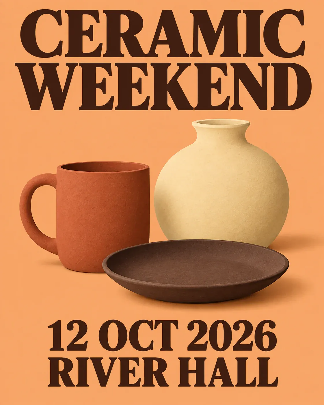
Three ceramic objects identify the market theme, while the headline and event details sit in separate areas
If you adapt this for a jewelry market or craft fair, replace the objects too. A new title above the same pottery still looks like a ceramics event.
2. Outdoor Jazz Poster: Separate the Headline and Instrument
Create a 3:2 landscape poster for an outdoor jazz event. Use a full-bleed dark-blue background, a simple golden-yellow saxophone illustration, and a few curved sound-wave lines to create diagonal movement. Avoid intricate key details. Place the large headline "OPEN AIR JAZZ" on the left in clear, bold cream-colored type, occupying most of the width. Keep the saxophone on the right, away from the letters. At the lower left, align "24 OCT 2026" and "HARBOR PARK" on two lines. Each text string should appear once. Do not add song titles, performer names, or sponsor logos. Use clean color blocks and sharp lines. Deliver the finished flat poster, without white borders or a physical frame.
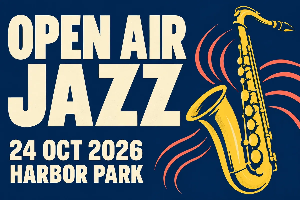
Dark blue and gold distinguish the jazz poster, with the instrument kept clear of the event text
The instrument can suggest movement without making the type lean with it. Tilted, overlapping words take longer to read on a phone.
3. Coffee Tasting Poster: Give the Photograph and Copy Room
Create a 4:5 portrait poster for a coffee-tasting event with a realistic still-life photography treatment. Photograph one dark-brown ceramic cup filled with black coffee directly from above. Place it toward the lower right, with soft side lighting that reveals the rim and coffee surface. A warm cream tabletop should extend to all four edges. Add only a few coffee beans, avoiding busy surface texture. At the upper left, set "COFFEE TASTING" in large dark-brown type across two lines. Below it, clearly place "07 NOV 2026" and "STUDIO 8". Left-align all three text groups and keep them off the cup. No extra copy, cup branding, words made from steam, or watermark. Keep the photography sharp and the layout quiet, with no outer margins.
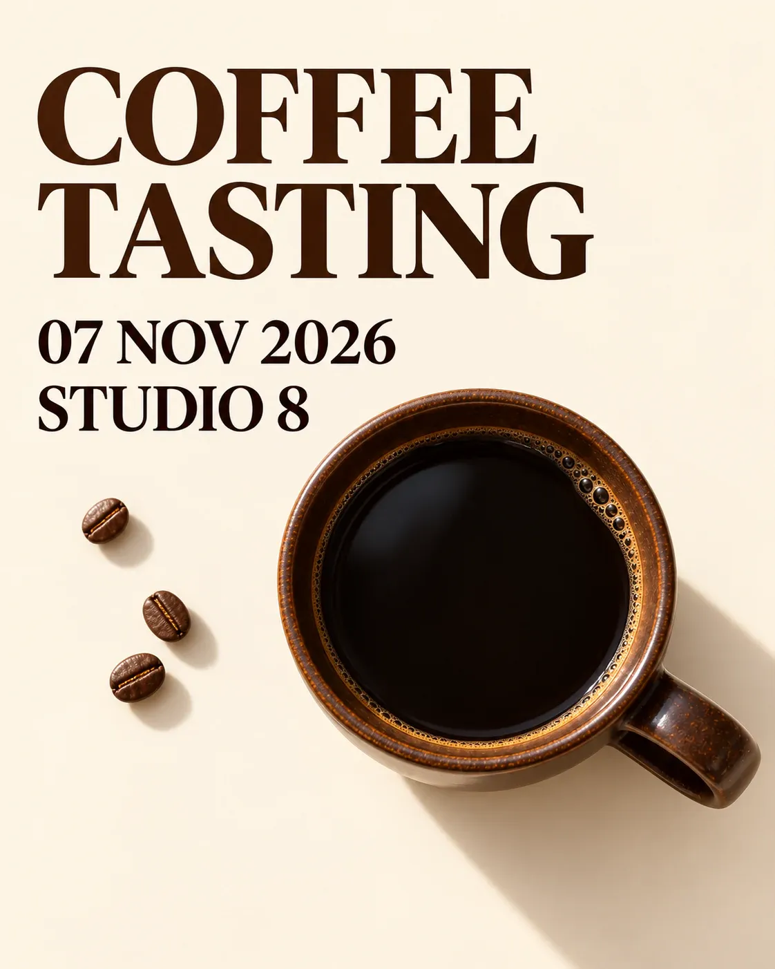
The coffee cup sits below the headline, date, and venue, creating a clear reading order from the upper left
For an event that requires registration, include the link on the page or in the caption accompanying the poster. Create and test any real QR code separately. A pattern drawn by an image model is not a working registration link.
4. Online Design Talk Poster: Organize the Details on a Grid
Design a square 1:1 poster for an online design talk. Use a Swiss graphic-design approach: saturated cobalt-blue and coral-red blocks form an asymmetric grid, with a fine cream line separating the text and graphic areas. At the upper left, set the large headline "DESIGN TALK" on two lines. At the lower left, place "18 NOV 2026" above "ONLINE". On the right, show an abstract three-dimensional ring and a cube, with different sizes and simple silhouettes. They must not resemble interface buttons or a software screenshot. Use high-contrast bold type, with each text string shown once. Keep graphics away from the lettering. Do not invent speaker names, portraits, awards, registration numbers, or institutional logos. Fill the canvas edge to edge, without white borders.

An asymmetric grid separates the online design talk's text and geometric objects, with ONLINE clearly identifying the format
Once a speaker is confirmed, an authorized portrait can replace the geometric objects. Give the speaker's name and session title their own typographic hierarchy rather than squeezing them into a spare gap.
5. City Night Run Poster: Make the Distance Prominent
Design a 4:5 portrait poster for a city night run. Fill the canvas with deep purple. A fluorescent-green running-track curve should sweep from the lower right toward the middle, forming a clear bend. Treat it as decoration, not a real map. At the top, use large white type for "NIGHT RUN". Below it, set "5 KM" in prominent green type, immediately followed by "21 NOV 2026". Keep all three text groups above the runners. Text should run horizontally, not follow the curve. Near the bottom, include two small adult runner silhouettes with plausible limbs and no identifiable faces. The track must not cross the date. Do not add a venue, route name, badge, or sports-brand logo. Keep the design energetic and clean, without an outer frame or blank borders.
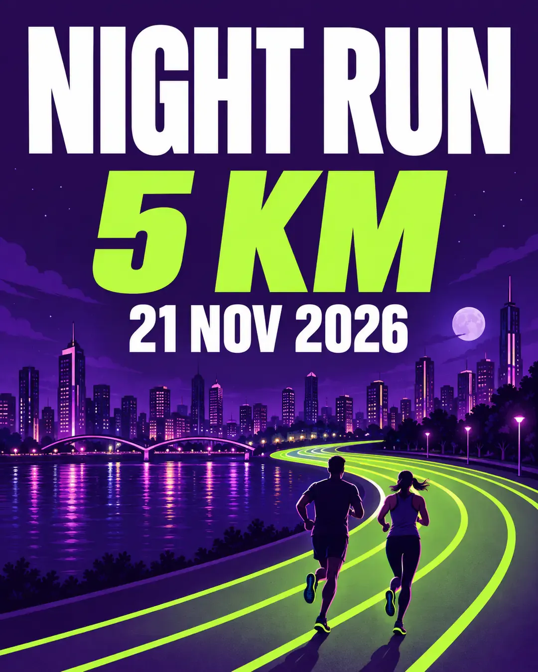
The night-run poster emphasizes the five-kilometer distance; the green track is decorative rather than a real route map
This works as a teaser visual. When publishing it, put the confirmed meeting point, meeting time, and registration method in the caption or event page. If the poster will circulate on its own, add those details to the layout. The decorative track cannot replace actual route information.
Sale Poster Prompts That Keep Offer Conditions Visible
Start product posters with approved source images. To remove surface dust from the shoot or adjust exposure, you can prepare product photos with PixPix Product Retouch. Check labels, shape, and material afterward. Show scratches or wear that are genuinely part of the item. If glare obscures a label, use a clearer source photo instead of asking AI to invent the missing text.
6. Discount Poster: Keep the Offer and Its Scope Together
Design a 4:5 portrait sale poster for one unbranded beige canvas tote bag. For a real product, use my uploaded photo as the reference and preserve its body proportions, two handles, and seams. Use a bright tomato-red background with a pale-pink curved block near the bottom. Show the complete tote toward the lower right. At the top, write "WEEKEND SALE" in large type. In the middle, make "20% OFF" the largest text, with clearly readable "SELECTED ITEMS" directly underneath. Put "06–08 NOV 2026" at the bottom. Do not add an original price, stock quantity, storewide-discount claim, or a coupon code I have not provided. Keep text off the handles. Use a clean, full-bleed layout, a sharp product image, and no additional products.
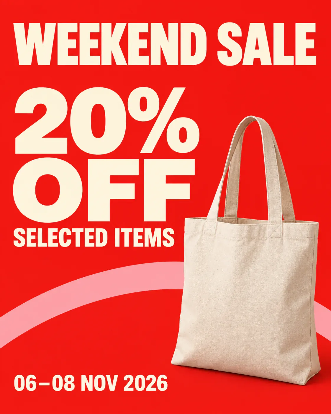
20% OFF sits directly above SELECTED ITEMS so the promotion is not mistaken for a storewide discount
"SELECTED ITEMS" defines the offer. It cannot disappear into tiny print. When you change the discount, check that line against the actual promotion too.
7. Bundle-Price Poster: Show the Quantity and Price Together
Create a square 1:1 poster for a ceramic-mug bundle offer. Use a full-bleed dark-green background. Place two unbranded mugs side by side in the lower half: one cream white and one pale aqua. Each mug must have exactly one complete handle, with its rim and base clearly visible. Set "BUILD YOUR SET" at the top. Make "2 FOR $30" the largest text in the middle, followed by clearly readable "SELECTED MUGS". Put "01–07 DEC 2026" at the bottom. Combine warm product still-life photography with orderly bold typography; the price should be more prominent than the headline. Do not add a third mug, duplicate handles, individual prices, crossed-out prices, or free gifts. Each text string should appear once. Fill the canvas without white borders.
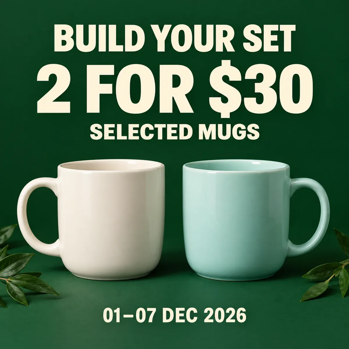
Two mugs illustrate the 2 FOR $30 bundle, while SELECTED MUGS states which products qualify
8. Free-Shipping Poster: Put the Threshold Next to the Headline
Design a 3:2 landscape free-shipping poster. Use a bright sky-blue background. On the left, set "FREE SHIPPING" in large dark-blue type, immediately followed by a clearly readable "ORDERS $50+". Place "01–07 DEC 2026" at the lower left. On the right, show one open kraft-cardboard parcel and a simple white paper ribbon. Keep the composition light and the text unobstructed. The box must have no address, logo, or shipping label. Use a clean three-dimensional paper-art style with consistent shadows. Keep the order threshold directly next to the headline. Do not invent eligible countries, delivery-speed promises, or coupon codes. Show each text string once, with the background extending to all four edges.
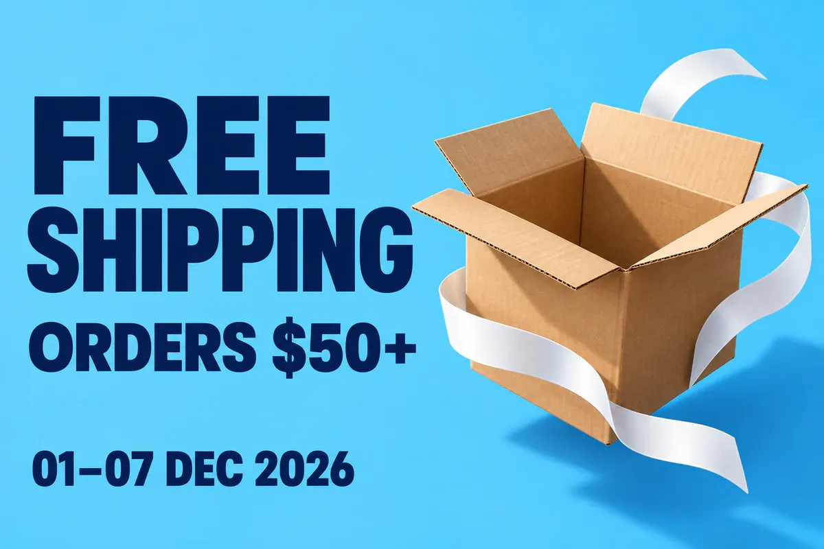
The $50 order threshold follows the free-shipping headline, with the parcel and copy occupying separate sides
Cross-border stores also need to provide the full terms, including eligible regions and excluded products. If those terms will not fit legibly on the poster, retain the main threshold and put the details on the campaign landing page. Do not simply leave them out.
9. New-Collection Poster: Lead with the Collection, Not a Discount
Create a 4:5 portrait poster for a new knitwear collection. Arrange three unbranded fine-knit sweaters in a tidy, partially overlapping flat lay: cream white, gray-blue, and burgundy. Keep necklines and cuffs clear, with simple fine-knit texture and no bodies or faces. Use a full-bleed pale-blue-gray background. At the top, set "NEW SEASON" in large dark-blue type, followed by "KNIT EDIT". Put "SHOP THE COLLECTION" at the bottom in moderately sized but clearly readable type. The three garments should form a compact group in the center, occupying about 40% of the image height, with clean blue background around them. Keep them clear of the copy. Do not add prices, discounts, bestseller rankings, or stock claims. Garment shapes must be plausible and sharp, with no outer frame.
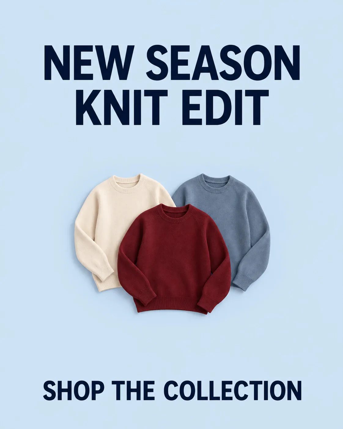
The knitwear poster leads with the new collection's name without inventing a discount
A launch does not need a giant percentage sign. If there is no price promotion, a collection name, relevant product details, and clear imagery give the poster plenty to work with.
10. Gift-Set Poster: Make the Contents Easy to Check
Design a square 1:1 home gift-set poster. Use a full-bleed berry-red background and a top-down view of an open pale-cream gift box. Include exactly three product categories: one unlit candle in a clear glass jar, one plain ceramic mug, and one pair of neatly folded solid-color socks. Place them in three tidy compartments, with their key outlines unobscured. Do not add other gifts. Set "GIFT READY" at the top, followed by "COZY HOME SET". At the bottom, write "CANDLE + MUG + SOCKS" on one clear line. Use sharp still-life photography and soft, realistic shadows. Center the box with clean red background around it. No shredded paper, ribbon, or plant decorations. Do not add prices, branding, limited-edition numbers, or watermarks. Fill the canvas without white borders.
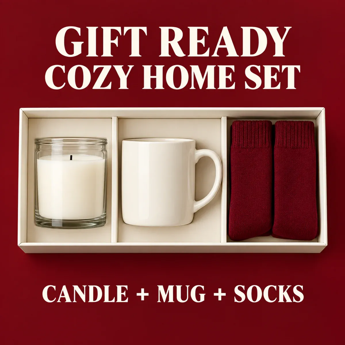
The gift box contains a candle, a mug, and socks, matching the three product categories named beneath it
Brand Poster Prompts Built Around a Clear Visual Idea
11. Repair-Service Poster: Show the Detail That Explains the Service
Design a 4:5 portrait poster for a shoe-repair service. Fill the canvas with deep orange. Show one unbranded off-white canvas sneaker angled from the lower left toward the upper right. A small dark-blue woven repair on the side should be clearly visible, with neat stitches and an intact sole. Include only one shoe. Set the large headline "EVERYDAY, REPAIRED" at the top and "REPAIR SERVICE" at the bottom. Use close-up product photography and simple typography, with the shoe clear of the headline. Do not add a before-and-after comparison, lifespan claims, environmental certifications, material-saving figures, or brand logos. The patch is a service concept and must look repaired, not like a split in the shoe. Keep the details sharp and the background free of white borders.
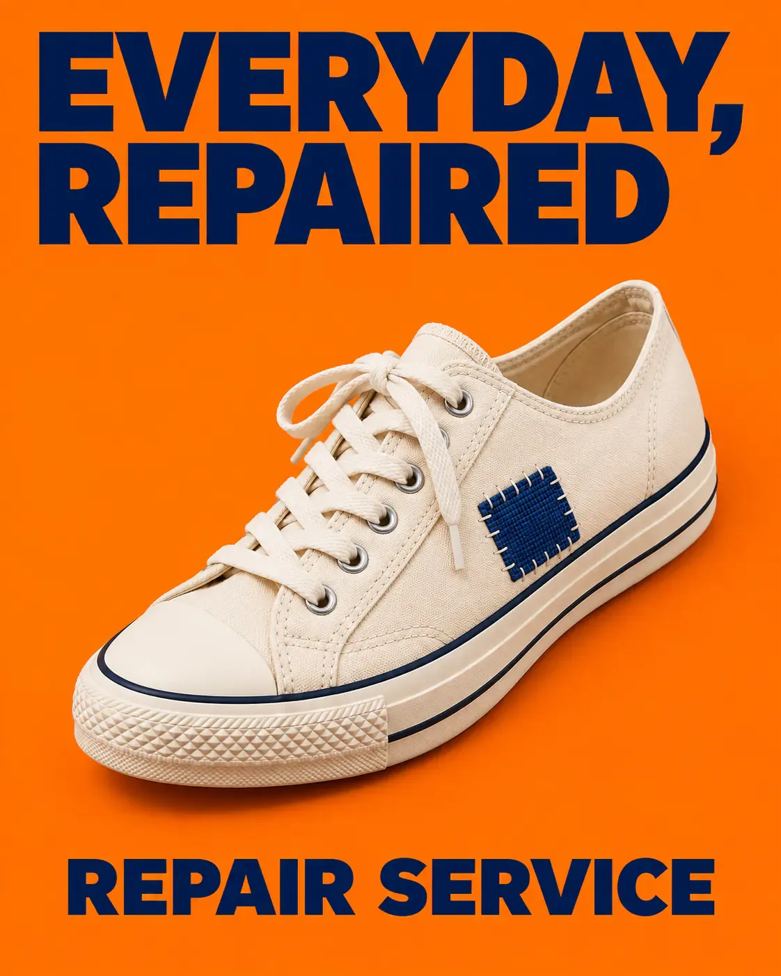
A woven patch explains the repair-service concept without unsupported lifespan or environmental promises
12. Everyday Lifestyle Poster: Let the Setting Support the Copy
Create a 3:2 landscape coffee-lifestyle poster. Morning light falls across a light wooden table, with one ceramic cup and one glass pour-over carafe in the right half. Keep object construction, table edges, and shadows plausible and clear. A pale-apricot wall occupies the left, and the scene extends to every edge. At the upper left, set "SLOW MORNING" in large dark-brown serif type. Below it, place "MADE FOR YOUR" and "DAILY RITUAL" on two lines. Keep the text clear and away from window shadows. Make the image warm without a yellow cast or haze. Do not add people, prices, benefit claims, logos, or watermarks. Use realistic still-life photography with a complete composition and no outer frame.
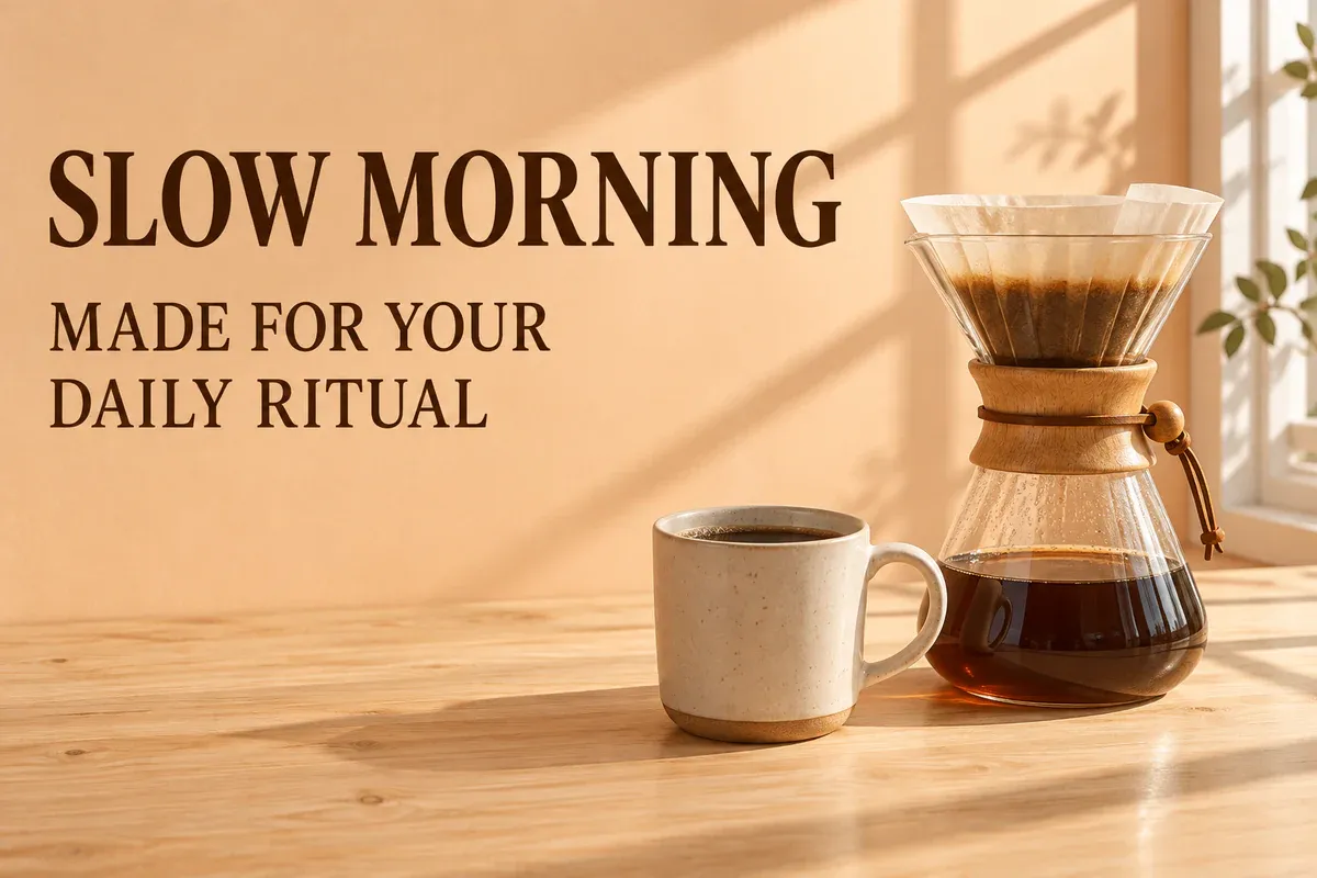
Morning light and everyday coffee objects establish the mood, while the short copy stays clear of busy shadows
Translate mood words into visible choices. Here, the sense of a slow morning comes from the light, cup, and table arrangement. Asking only for a "soothing atmosphere" leaves much more of the composition unspecified.
13. Home-Design Poster: Build the Layout Around a Strong Silhouette
Design a 4:5 portrait home-design brand poster. Use a saturated lemon-yellow background. Place one simple red modular lounge chair in the lower half, showing a plausible seat, backrest, and support structure. Do not copy a recognizable signature design by a well-known designer. Turn the chair slightly toward the front right, with a natural shadow on the background floor. At the top, set "FORM & COLOR" in bold dark-purple type across two lines. Put "OBJECTS FOR LIVING" at the bottom. Use a geometric commercial-photography composition with clear lettering and no overlap between the chair and text. No price, material-performance claims, or brand logos. Keep the image sharp and full bleed, without white borders.
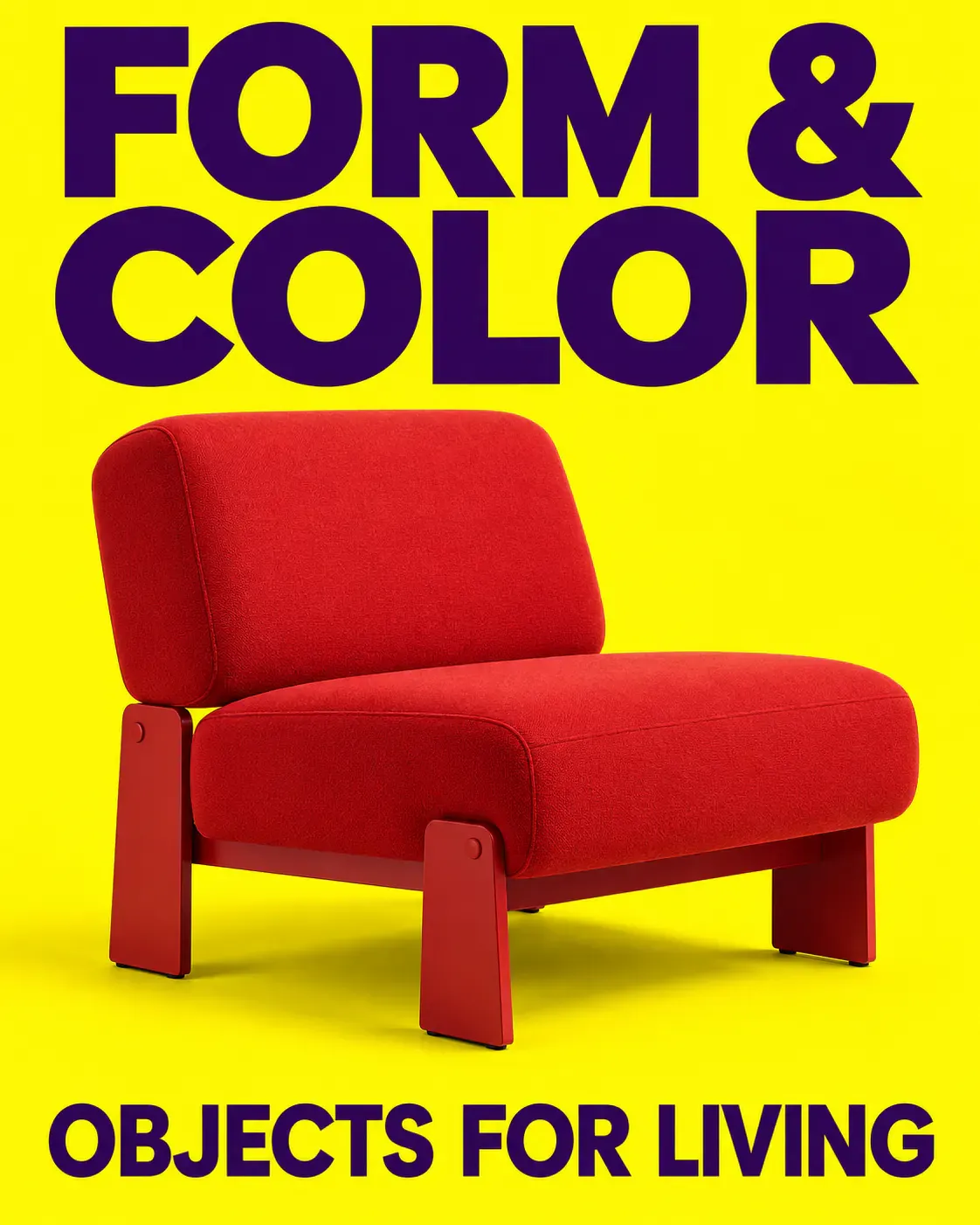
A red chair stands out against yellow in the home-design poster, with the headline kept separate and legible
Upload your own product photos for a real brand. The original concept chair in this template is not a substitute for a photograph of an item you sell.
14. Maker Poster: Leave Room for the Person and the Work
Design a 4:5 portrait poster for a handmade ceramics brand. Show a fictional adult Black woman ceramic maker wearing an unbranded indigo apron, seated behind a pottery worktable. She looks down at one bowl she is trimming. Both hands should naturally touch the same bowl, with complete, anatomically plausible fingers. Keep only a few necessary tools on the table. The warm terracotta studio background should fill the canvas, with her face, hands, and bowl clearly visible. Set the large headline "MEET THE MAKERS" at the top and "SMALL-BATCH CERAMICS" at the bottom. Keep text off her face, hands, and work. Use natural documentary-style photography without smoothing her skin. Do not invent a name, award, store address, or watermark. Deliver a finished poster without white borders.
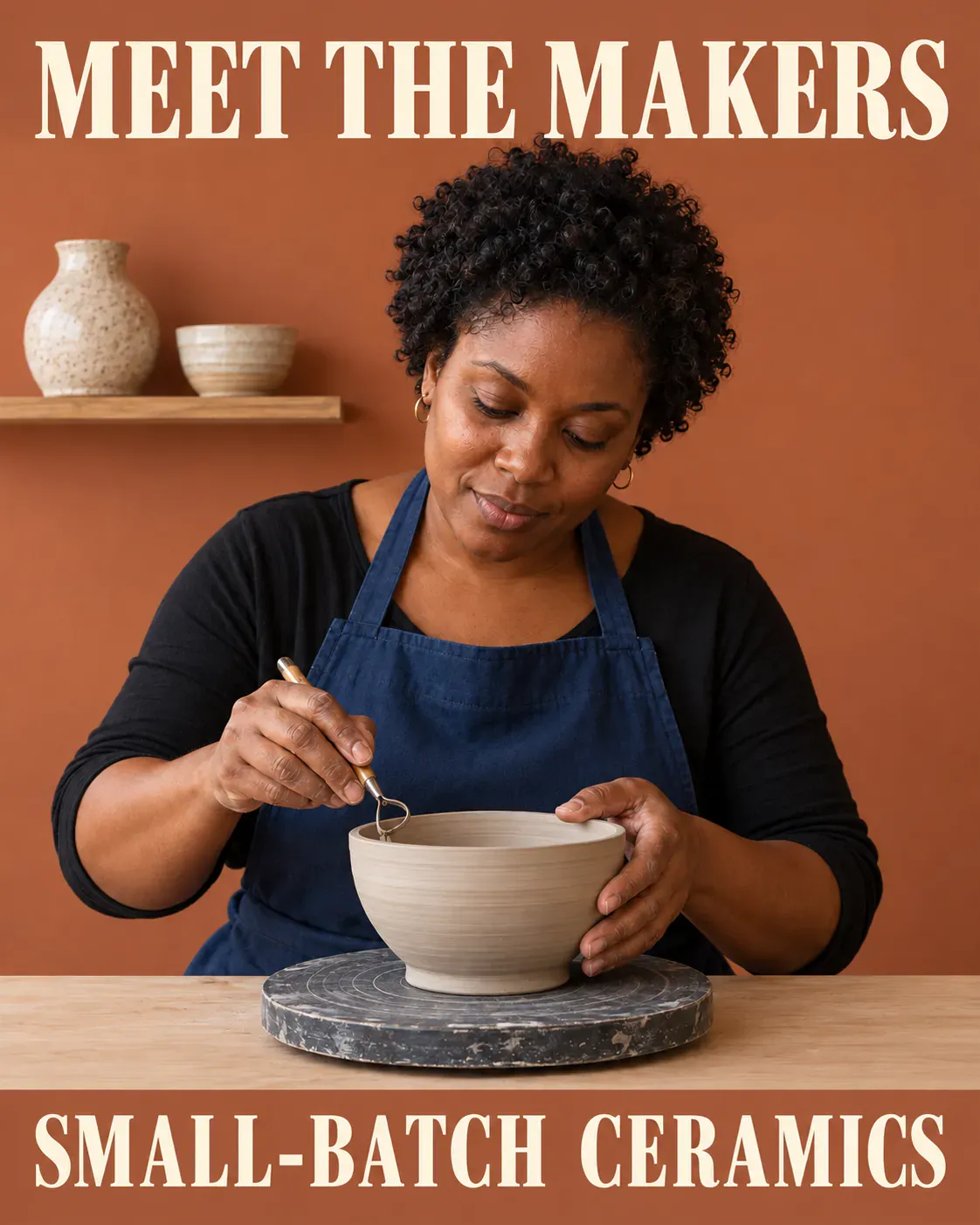
The maker's gaze, hands, and clay bowl connect the scene, with text kept clear of the working area
To introduce a real team, use authorized portraits and genuine images of their work. Do not present a generated person as an employee or founder.
15. New-Color Poster: Keep the Product the Same Across Shades
Create a square 1:1 poster for new portable-water-bottle colors. Use a saturated light-purple background. Arrange exactly three identical unbranded bottles upright at staggered heights, in coral orange, mint green, and cream white. Their body height, cap shape, and capacity proportions must match. Each bottle has one cap only; do not add straws, handles, or labels. Set the large headline "COLOR YOUR DAY" at the top and "THREE NEW SHADES" at the bottom. Use bright, sharp product studio photography, with soft shadows falling in the same direction. Keep text away from the bottle openings. Do not add specifications, prices, environmental claims, or brand logos. Show all three bottles completely inside the canvas, without an outer frame or white borders.
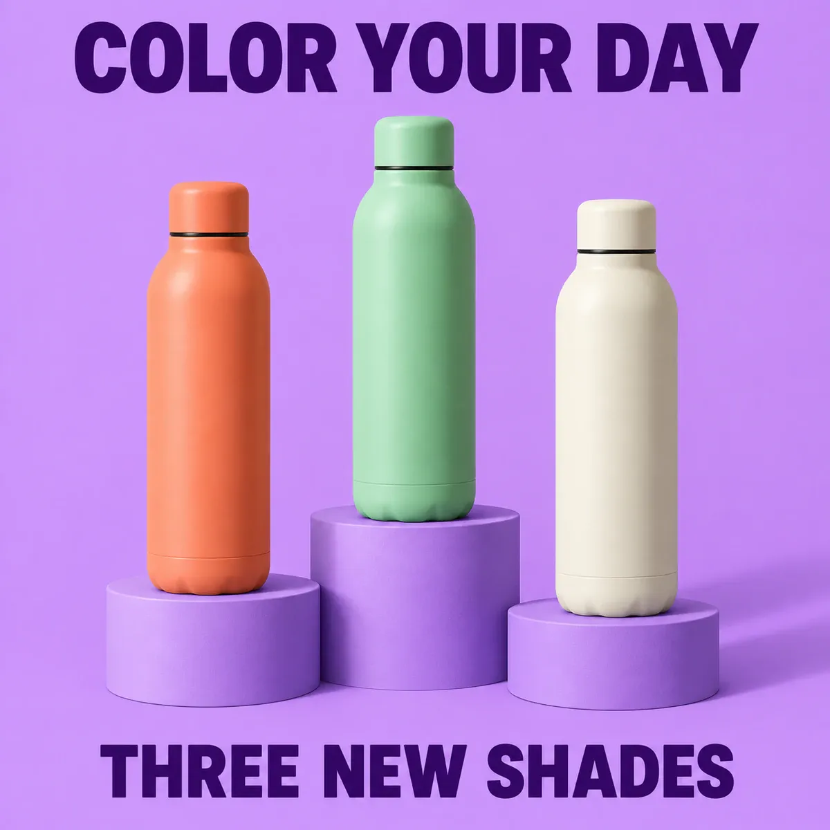
Three bottles retain the same construction and proportions, with color providing the visual variation
Check that they still look like the same product. A changed cap, handle, or capacity turns a color range into three different items.
How to Change a Date, Price, or Line of Poster Copy
When you already like the poster, use that version as the edit input and name the exact text to replace. For a date change to the sale poster in example 6:
Edit the poster I uploaded. Replace only the bottom date "06–08 NOV 2026" with "13–15 NOV 2026". Preserve the date's position, size, typeface, and color. Do not change the headline, 20% OFF, SELECTED ITEMS, bag shape, background, or composition. Remove the old date completely and show the new date once only. Add no other text.
You can also edit an existing poster with PixPix's image-editing tools. This is a general image-editing entry point; check the actual options on the page for the model being used. Upload the current version and mark or describe the date area. After the edit, compare handles, letter spacing, and other numbers with the original, not just the line you changed.
If repeated edits alter the product or layout, return to the last approved version. For an exact logo, long terms, or a working QR code, keep the background and main visual, then add the original asset and editable text in layout software. An AI-generated poster is an image by default; its lettering is not automatically a separate editable text layer.
Before exporting, view the poster at its actual display size. Can you read the headline at a glance? Is the date fully visible? Does the price sit next to its conditions? If the source looks clear but the thumbnail is difficult to read, enlarge the type, reduce the copy, or rework the layout. More pixels will not fix an overcrowded design.
GPT Image 2.5 Poster Design FAQs
1. Can I make a Chinese poster by replacing the quoted English copy?
Replacing the quoted copy is a good start, but Chinese characters need different spacing and line breaks. Provide the final Chinese headline exactly, along with the line count, alignment, and text-area width. Check characters, punctuation, and leftover English after generation. If the title grows longer, adjust the layout instead of forcing it into smaller type.
2. Are these posters ready to print?
The examples here are designed for screens. For print, confirm pixel dimensions, bleed, trim boundaries, and color requirements against the intended physical size, and check file specifications with your print provider. Do not use the compressed blog illustrations as print masters. Make an actual-size proof to check QR codes and small terms.
3. How do I keep several posters for one event visually consistent?
Use one approved poster as the reference. Retain its main colors, type style, headline placement, and key graphic, changing only the subject or copy needed for each version. Restate those fixed elements in every edit request and compare the outputs side by side. For pixel-identical logos and information panels, add the original assets consistently in layout software.
Official References

AI Image Tool Built for E-commerce Teams
For new product launches, advertising, and promotional campaigns, use AI to generate product images, scene visuals, ad creatives, and short video assets — making content production faster.