How do you generate AI images? With PixPix, you can turn a single sentence into a usable visual.
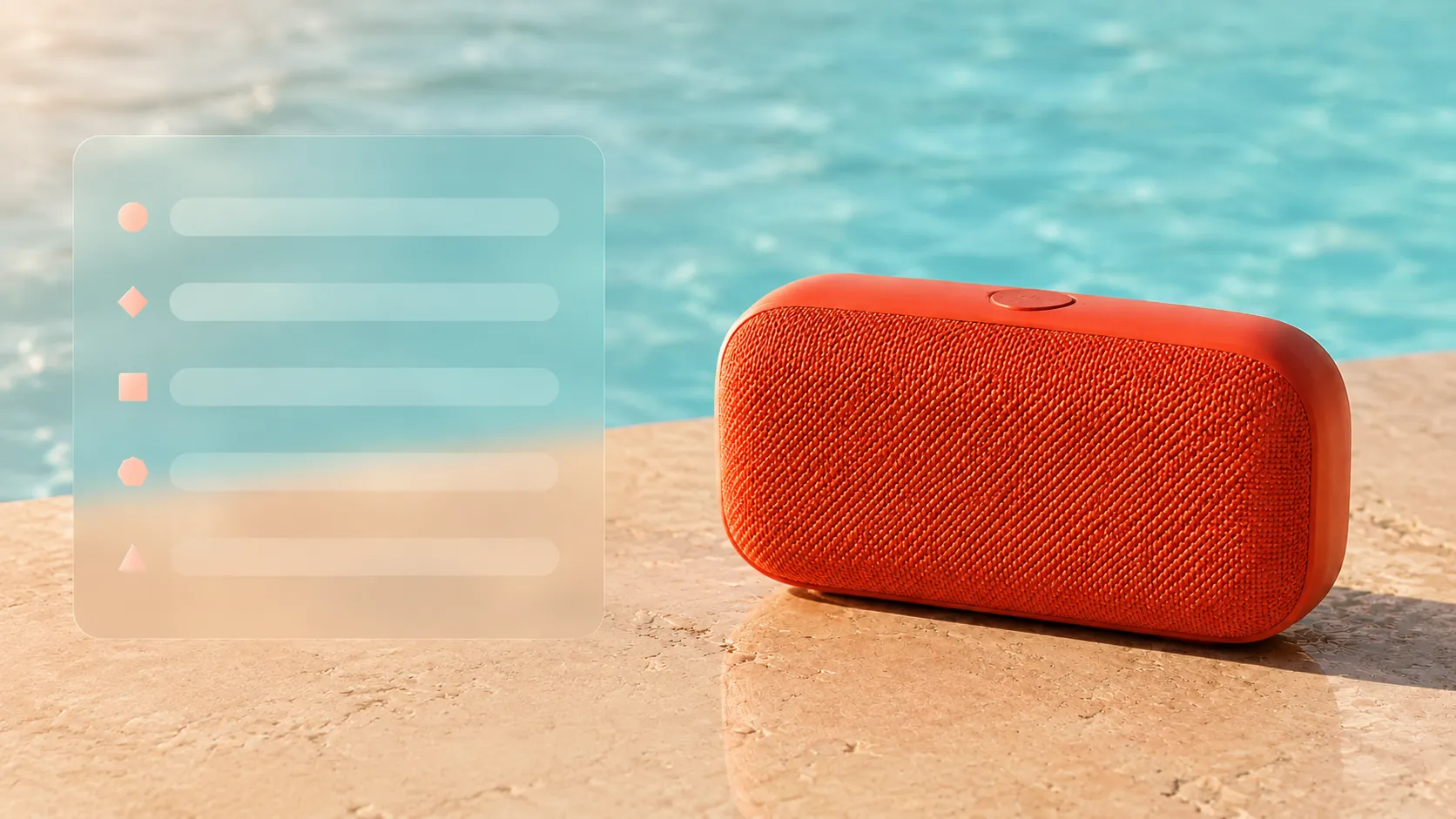
When using AI image generation for the first time, the most common stumbling blocks are usually not the buttons, but rather three key questions: Should you start with text or upload a reference image? How detailed should your prompts be? And if the first result isn’t ideal, what exactly should you adjust?
This article walks you through a repeatable AI image-generation workflow using PixPix. You’ll begin by defining the purpose and aspect ratio of your image, then craft a descriptive prompt that includes lens type, subject, environment, lighting, and style. Next, we’ll explore an original portable speaker example to learn how to refine results, make single-variable adjustments, and further edit or repurpose the generated images for video production.
The case studies and prompts in this article have been redesigned specifically for instructional purposes and do not reflect actual test results from any particular model.
Quick takeaway: Decide where the image will be used first.
A “beautiful AI-generated image” isn’t necessarily a “usable AI-generated image.” Before you start generating, answer these four questions:
Is the image intended for product main visuals, social media content, article covers, or banners?
What is the most important subject in the scene?
Which visual elements must remain consistent, such as product shape, character identity, or brand colors?
Will the final image be used directly, or will it require further editing, enlargement, or conversion into video?
These answers will determine whether you should use text-to-image or image-to-image generation, which aspect ratio to choose, and which details in your prompt need to be specified most clearly.
Recommended sequence: Define the purpose → Choose the generation path → Lock the aspect ratio → Write the initial prompt → Refine the structure → Adjust only one major variable at a time.
Choosing between text-to-image and image-to-image generation
Currently, PixPix’s official website offers both text-to-image and image-to-image options: Text-to-image starts with a textual description, while image-to-image allows you to upload a reference image, sketch, or screenshot, enabling the generated output to maintain the original image’s structure, composition, or style.
Start with text-to-image when there’s no fixed object.
When exploring new characters, conceptual scenes, article covers, or fictional product ideas, text alone often suffices. At this stage, the focus is on breaking down your “idea” into visual information that the model can interpret—rather than preparing a reference image upfront.
For example, “Create an advertisement image with a strong summer vibe” remains too abstract. The model doesn’t know what the main subject is, where it’s located, how the lighting works, or how far away the camera is. Breaking it down into specific objects, environments, and lighting conditions makes it much easier to achieve a discernible result.
Prioritize reference images when consistency is required.
If the image must preserve a real-world product, a person’s appearance, pose, sketch structure, or existing composition, consider using image-to-image generation or methods that support reference images.
However, a reference image does not guarantee perfect alignment in the final result. Always verify after generation:
Have the product’s outline, color, and material remained unchanged?
Has the face, clothing, or accessories retained their original identity?
Has the composition maintained its relationship to the reference image?
Have any text or logos in the reference image been altered?
Has the background style inadvertently influenced the subject?
If consistency is absolutely essential, your prompt must explicitly state “what remains unchanged,” rather than merely describing what you wish to add.
Establishing a clear generation goal with an original case study
In this article, we define a fictional visual concept for a new summer product: a nameless, coral-orange, rounded-corner portable Bluetooth speaker placed on a creamy-white travertine tabletop beside a light-blue swimming pool. In the late afternoon, slanting sunlight enters from the left, leaving a few droplets on the surface, while the background retains simple water ripples, creating an overall fresh, modern commercial photography aesthetic.
This image is planned for a social media new-product teaser, so we’ll start with a vertical composition and leave space above the main subject for future layout. The scene must not include brand logos, packaging text, additional electronic devices, or human hands.
First, let’s break down the objectives into two categories of constraints:
Must remain stable | Can be explored |
|---|---|
Coral orange, rounded‑corner speaker; no brand logo; complete subject | Water‑wave shapes and droplet distribution |
Off‑white travertine countertop, light blue swimming pool | Background blur level |
Evening sunlight on the left side, natural shadow interaction | Reflections and highlight details |
Vertical composition, with blank space at the top | Slight variations in specific lens distances |
This breakdown helps prevent the prompt from becoming overly long. Information that must remain consistent should be explicitly stated, while exploratory elements allow room for flexibility in the model’s output.

Caption: At the starting point of this example, only the swimming pool, travertine countertop, camera position, and warm light on the left are retained, providing clear environmental constraints for later addition of the product.
Structure the prompt into five checkable modules
Rather than piling up abstract adjectives like “high‑end,” “stunning,” or “perfect,” assign each phrase a distinct visual task. A beginner‑friendly structure could be:
Lens and composition + Subject and features + Environment and placement + Lighting and atmosphere + Visual style.
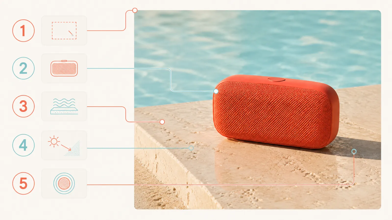
Caption: Numbers 1–5 correspond respectively to lens and composition, subject, environment, lighting, and visual style; numerical notes are placed in the body of the text to avoid cluttering the image with lengthy descriptions.
Lens and composition determine how the scene is framed
“Close-up,” “medium shot,” “bird’s-eye view,” “eye level,” “subject centered,” and “blank space above” all directly influence the overall arrangement of the image. If the image needs space for a title or button, reserve that area during the initial generation phase rather than forcibly cropping the subject at the end.
Subject and features clarify what’s in the frame
Start with nouns, then add details about shape, material, and color that truly affect recognition. For example:
A brandless coral orange portable Bluetooth speaker, with a rounded‑rectangular body, fine fabric mesh, and a single subtle button on top.
“Brandless” merely reduces the likelihood of random logos appearing; after generation, still verify that no pseudo‑text or logo‑like graphics have been introduced.
Environment and placement define spatial relationships
The environment isn’t just a background name—it also clarifies how the subject interacts with its surroundings. In this case, “placed on a travertine countertop by the pool” is clearer than simply “pool background,” as it specifies both the surface, location, and contact relationship.
Lighting and atmosphere unify the overall texture
Describe where the light comes from, its softness or hardness, and whether the overall tone leans cool or warm. For example, “warm evening sunlight slants in from the left, casting a gentle short shadow behind the speaker toward the right.” This approach is easier to verify than merely stating “cinematic lighting.”
Visual style serves as the final finishing touch
The style can be “modern commercial product photography,” “clean editorial photography,” or “soft paper-cut illustration.” Avoid including competing elements like photography, oil painting, 3D rendering, and vintage film all within the same prompt.
Complete the first generation in PixPix
Enter the PixPix AI Image and Video Generator, starting with “text-to-image” for this example. Settings may vary between models; always refer to the current generation panel for available options.
First, choose an aspect ratio suitable for the intended publication platform.
The aspect ratio should align with the final use case, rather than deciding after the image is generated:
Vertical aspect ratio: better suited for mobile social media content and portrait posters;
Square aspect ratio: ideal for content that needs to fit various feed layouts;
Horizontal aspect ratio: more appropriate for blog covers, web banners, and presentations.
For this case, aiming to create a social media new-product teaser, we recommend using a vertical aspect ratio. If you later plan to produce a blog cover as well, generate a horizontal version once the composition is stable—don’t simply fill the sides of the vertical image mechanically.
Use the complete initial prompt
Original case prompt
Vertical mid-close-up product photography, leaving a clean white space at the top. A coral-orange portable Bluetooth speaker from an unknown brand, featuring a rounded-rectangular body, finely textured fabric mesh, and understated buttons on the top, fully placed on a creamy-white travertine tabletop beside a light-blue swimming pool. The surface has a few distinct water droplets, while the background displays simple, gentle ripples. In the warm evening light, the sun shines diagonally from the left, casting a soft natural shadow behind the speaker’s right rear side, with subtle highlights on its coral-orange body. A fresh, modern commercial product shot—real materials, clean composition, no people, logos, packaging text, or other electronic devices.
This is a prompt written specifically for the original case study in this article—not the original prompt from a reference article, nor does it guarantee that any particular model will execute it word-for-word.
In the first round, focus on structure first; don’t rush into details.
After generating, first zoom out to view the overall composition, then check each element in turn:
Can you spot the speaker at first glance?
Is the main subject cropped or obscured?
Is there enough white space at the top for subsequent layout?
Do the spatial relationships among the tabletop, pool, and speaker make sense?
Are the light direction and shadow interactions natural?
If the composition is fundamentally sound in the first round, it’s worth continuing to refine. Don’t abandon a well-composed result just because one button isn’t perfectly detailed.

Caption: This instructional example maintains proper relationships among the product, scene, and lighting, but the subject is too small and occupies too much foreground space—perfect for demonstrating how to adjust only the lens distance and subject proportion.
Modify only one major variable at a time.
When the generated result deviates from the target, clearly identify which category the issue falls under, then revise the corresponding phrase.
Identified issues | Prioritize revising |
|---|---|
Subject too small | Lens Distance and Subject Proportion |
No Negative Space Above | Composition Position and Negative Space |
Image Resembles an Illustration | Visual Style and Material Expression |
Chaotic Sunlight Direction | Light Source Direction and Shadow Direction |
Speaker Shape Continuously Changing | Switch to Reference Image and Declare Preservation of Overall Form |
Pseudo Text or Logo Appears | Clearly No Text, with Subsequent Local Edits for Cleanup |
For example, if the subject is too small, simply modify the beginning as follows:
Vertical Close-Up Product Photography: The speaker occupies roughly half the frame height, with ample negative space above.
Leave the rest—regarding materials, environment, and lighting—unchanged for now. This makes it easier to determine which specific change caused the shift.
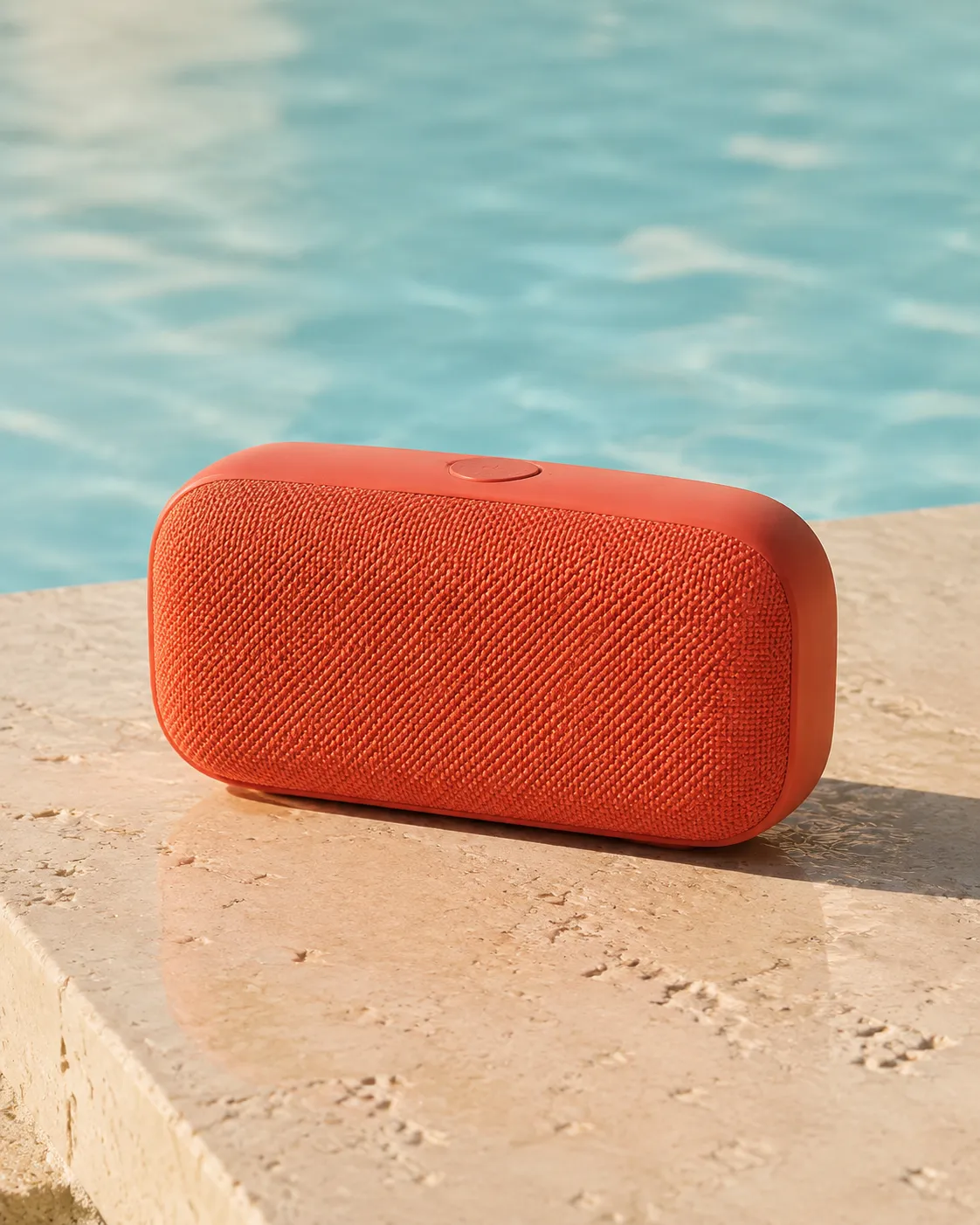
Caption: The revised version enlarges the subject while maintaining negative space above; the coral orange exterior, fabric mesh, shadowed contact areas, and rear-right shadow collectively create a clear visual focal point.
Don’t cram all errors into negative prompts
“Don’t be blurry, don’t distort, don’t look bad, don’t be low quality” cannot replace clear positive descriptions. Negative constraints should address real risks—for instance, in this case, “no people, logos, packaging text, or other electronic products.”
If the model keeps misinterpreting the subject, a more effective approach is usually to simplify conflicting descriptions, adjust camera settings, or switch to reference images, rather than continually adding negations.
Select one candidate image worthy of further editing
Don’t just choose the result with the most details. A more practical selection order is:
Subject Identity and Overall Composition;
Contact, Perspective, and Light–Shadow Relationships;
Materials and Colors;
Small Decorations, Edges, and Local Imperfections.
Compositional and subject errors typically require re-generation, whereas minor issues like pseudo text, water droplet shapes, or edge imperfections are better suited for subsequent local edits.
PixPix’s official page currently showcases capabilities such as partial retouching, image enlargement, background replacement, and quality enhancement. Once the overall composition is established, you can continue refining details, expanding the canvas, or improving image quality; alternatively, static frames can serve as starting points for subsequent AI‑driven video creation.
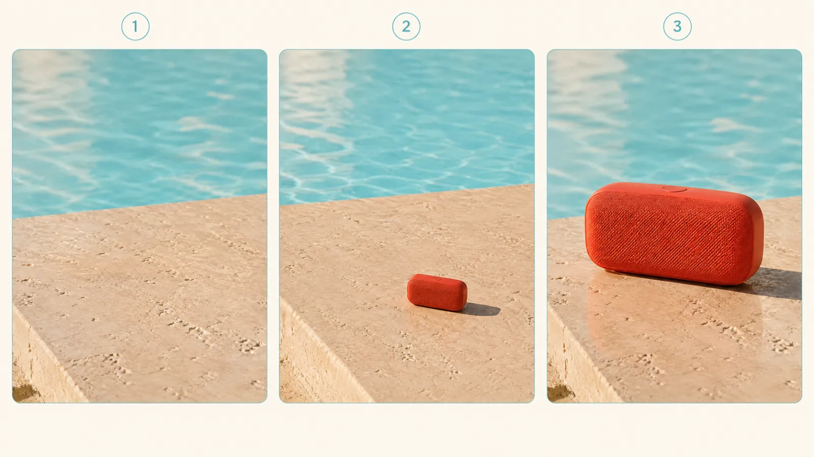
Caption: The three-panel sequence illustrates, from left to right, the scene’s initial state, the first round of issues, and the intended corrections. The key comparison focuses on subject proportion and hierarchical structure within the frame, rather than treating instructional mockups as actual model outputs.
A Set of Reusable Prompt Templates
General Template
【Composition and Lens】, the main visual focus in the image is the 【Subject】, which possesses 【color, shape, texture, and motion】. The subject is situated within a 【context and specific location】, forming a 【contact or spatial relationship】 with a 【surface or other objects】. Light from a 【direction】—whether warm/cool or soft/hard—creates distinct 【highlight and shadow characteristics】. The overall style is a 【single visual aesthetic】, preserving 【layout space or key compositional elements】, while avoiding any 【disturbing elements directly related to the task】.
When filling out the template, prioritize retaining words that alter the composition of the image. If removing a word does not affect the intended outcome, that term is usually unnecessary.
Frequently Asked Questions
Is longer always better for prompts?
No. Prompts should cover key visual decisions, but length alone does not equate to control. Repeating adjectives, conflicting styles, or abstract concepts that cannot be visually represented may instead dilute the subject matter.
Can Chinese prompts be used directly?
You can start with the language you find easiest to express yourself clearly. The key is to specify the lens, subject, environment, lighting, and style, then evaluate how well the chosen model interprets your description. If certain terms are repeatedly misinterpreted, try substituting more precise synonyms.
Can product images be generated without reference photos?
It’s possible to generate conceptual images of fictional products; however, if you need to accurately reproduce the appearance, color, and details of an actual product currently on sale, relying solely on text often makes it difficult to maintain consistency. In such cases, upload clear product reference images and verify each detail against them.
Why do different results appear from the same prompt?
AI-generated images involve an element of exploration, so the same description may yield varying compositions and details. Clearly articulating essential information and using reference images or building upon previously successful outcomes allows for more controlled local adjustments than repeatedly starting from scratch.
When should I upscale an image?
First confirm the composition, subject, lighting, and materials, then proceed with quality enhancement. Upscaling can improve output size and certain details, but it will not automatically correct errors in spatial relationships or product structure.
Summary
Generating AI images isn’t about crafting a “perfect” prompt in one go; rather, it breaks down the creative process into a series of assessable choices:
Define the purpose → Choose between text-to-image or reference-based generation → Lock the aspect ratio → Describe the lens, subject, environment, lighting, and style → Refine the composition → Make single-variable adjustments → Perform localized edits and finalize the output.
When using PixPix for the first time, you can directly apply this template to create a concept image. If your task involves real-world products or specific characters, prepare reference images from the outset, list consistency requirements as checklist items, and then proceed with generation and editing.

AI Image Tool Built for E-commerce Teams
For new product launches, advertising, and promotional campaigns, use AI to generate product images, scene visuals, ad creatives, and short video assets — making content production faster.